
It's been a few weeks since we had real new info after the wake of E3. A Fan Friday another look at what was on display at E3 the next week, then an updated video of the bounty hunter we had way back.
All in all I've been a little uninspired going over the same information again so I passed on the whole thing. Now we get maps.
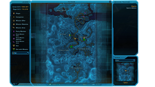
Now I will not say this map update was the greatest thing that has come from a Fridays update, but if you ever wanted to know what BioWare means by polish. Well here is your answer.
Let put this in a little prospective. Imagine going to a wedding and instead of a 3 tear cake the happy couple have a 100 foot wide cake 3 storeys high, then on top they have lookalikes to take the place of the plastic figures that would normally represent them.
Well that is what BioWare mean by game polish.
These maps are way over the top and so much more info than you would want or need. If the intention is having the nicest looking over the top MMO map around they win hands down.
But for me I like my maps simple.
What I need in a map is way-points, vendor locations/towns/trainers and simple things like mail and the AH. When I grab a mission I take around 15-20 seconds to plan my route then head off. I will open the map on the way to check I'm going in the right direction which take 1-2 seconds.
Even the act of checking the map can be passed on with a simple on screen way-point indicator. This much clutter on my world map will only lead to confusion. Which I found in my play time in Austin. There just seems to much clutter when you need to pinpoint a vendor or a way-point. Also the lack of plotting your route resulted in checking the map time and time again.
This is something that should be in at release, this would save a heap of time and simplify all that map clutter when you just want to get to your next quest area.
I'm not sure how many times in Austin I went the wrong way without the use of some sort of on screen indicator. The map sure looks nice and all but we had a good saying in the British Army "K-I-S-S" which means "Keep It Simple Stupid"
This should also apply here with the maps.
The more simple a system is the easier is it to use. Putting things in that don't enhance the core function which in this case is just getting from A-B and seeing vendor locations and the like becomes redundant.
I'm all for polish. But polish just for the sake of it seems a little wasteful.
If I have the option at release I would reduce this to a simple wire frame just for ease of use. I do not need to see every rock/chair or fallen tree that litters the planets I just need to see where I'm going to next and how to get there.
It's also about time for another Fan Friday to show its head again. So I'm pinning my hopes on Comic Con for at least something that will spark my interest with new never seen before information about the game.
Until next time, MrWarlock signing off.
No comments:
Post a Comment